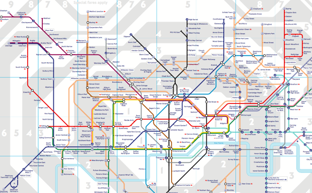
Sometimes in design accuracy is not helpful to users. Take the iconic London Underground Tube map, designed by Harry Beck in 1931. In so many ways it’s perfect, and yet as an accurate reflection of where the stations and lines actually are, well, as a map it doesn’t really work at all. In fact, it’s more like a diagram, designed first and foremost for the user experience.
Which is why the geographically-correct map (pdf) of the London Underground is so fascinating, and has caused such a stir since it was released in response to a Freedom of Information Act request.
As City Lab points out, the London tube map approach doesn’t work everywhere:
In 1976, New York’s Metropolitan Transportation Authority commissioned designer Massimo Vignelli to revamp the subway map. His colorful end result shrank Central Park and distorted Manhattan’s geography in exchange for clean lines and angles like London’s—and New Yorkers hated it.
Why mess with a city whose easily navigable grid system—above 14th Street, anyway—already made perfect sense? Vignelli’s contribution was yanked in 1979, replaced with a version of the messy but geographically accurate version in use today.


