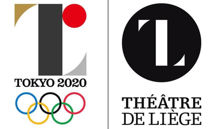
Tokyo 2020 logo designed by Kenjiro Sano (left) and Théâtre de Liège logo designed by Olivier Debie.
A few weeks ago we interviewed Hotfoot Founder and Creative Director Charlie Haywood about his views on the newly unveiled Tokyo 2020 Olympic logo. Today brings the shock announcement that the logo has been scrapped due to allegations of plagiarism. We picked things up with Charlie again…
So, let’s get right to it, when you saw the two logos side by side did you think “yep, that’s a clear case of copying” or “nope, that’s probably just a coincidence”?
Only the designer knows if he used it as a source of inspiration. But to put things in perspective there are literally millions upon millions of logos all over the world so I imagine it bears resemblance to a number of logos. However, for a designer to copy another logo for the most high profile sporting event, viewed by millions of people across the globe, would be utter madness. Part of the design process is to make sure – as much as anyone can – that this does not happen. Is the designer being used as a scapegoat now there’s major controversy? Maybe.
When you create a visual identity for a client, is this a source of concern, that your design might be coincidentally similar or even the same as something already out there?
It’s not really a concern. At Hotfoot – and most other agencies – we go through a design process from written brief and initial sketched ideas to finalised designs – all with the input of the client. There’s a clear rationale as to why we make the decisions we do to go in a particular direction with a design.
Aside from coincidence, is there also the risk that you might almost subconsciously get an idea for something that later surfaces in your own mind during a project, and genuinely feels like an original idea?
Yeah that probably happens quite alot although I think a design would recognise it before it went too far. Any logo designer will tell you that they go through perhaps a hundred initial sketches so at some point it will look like something or other that’s been designed before
Is there anything that can be done about this? Obviously big brands can afford to conduct a far bigger trawl of records than smaller companies…
Create a logo which is meaningful and appropriate to your business or product rather than something which is generic.
Show your logo around to colleagues and friends at it’s early stage.
A brief is important, as are initial ideas and sketches. They are your paper-trail of your final logo designs.
Also, when we design a logo for a client in a certain industry we make sure that their logo is different from their competitors – this also helps them stand out from the crowd.
Have you ever had your own work plagiarised?
A long time ago we created a logo as part of a design pitch to a charity which we didn’t win although the feedback was excellent with the promise of work in the future. A few months later I saw the ‘new’ logo by the agency which did win the work. It was almost identical. They even used the same obscure typeface. I did follow this up with the charity and of course they denied everything. I just didn’t buy it but there’s not a lot I could do.

